Forerunner Art
|
by Siliconmaster (2015)
|
Part 1: Style
In the story of the Halo games, the ancient Forerunner aliens built massive constructs like the titular Halo rings, then vanished in an apocalyptic last stand against an unstoppable parasite. Their architecture's exact construction and cool color palette contrasts with both the Covenant's neon curves and the human's rough, ramshackle military gear. In addition, the sheer scale of the Forerunner design makes the Covenant's hasty occupation, with crates and shield generators haphazardly strewn about, all the more meaningful. There have been consistent patterns throughout the series, but each game has tried to refine or reinvent the look, and as a result there are many different approaches to "true" Forerunner design.
In the past, Custom Mapping Team levels featured various shader replacements; they changed the textures but rarely made substantial changes to the actual architectural style. However, because almost all of TSC:E's level geometry was reconstructed from scratch, we had the unique opportunity to decide exactly what we wanted our look to be. With 7 games made in the Halo universe, and at least 5 different Forerunner styles -- ODST and Reach didn't add a whole lot -- we had a lot of options to draw from.
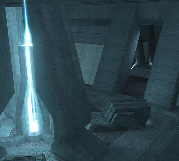
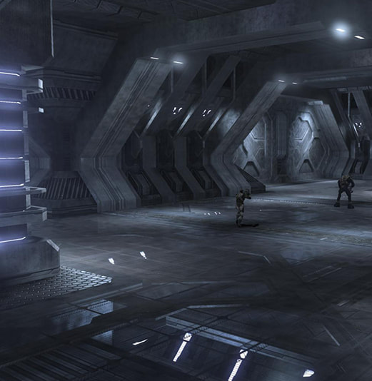
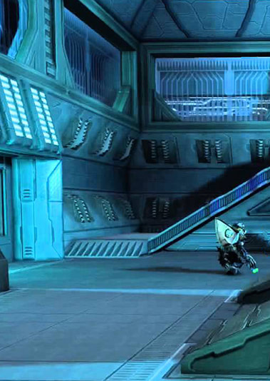
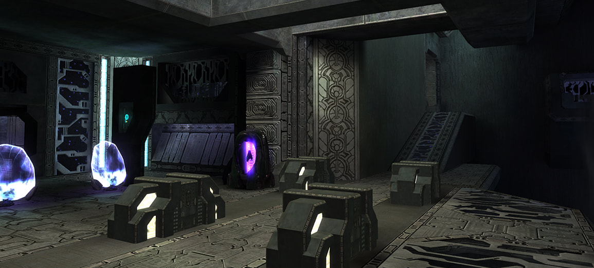
Halo 1's Forerunner style centers around angled walls, hard edges, and tall looming shapes. It was all about interlocking pillars, bevels, and texture strips. While 2001-era graphics meant that there were sometimes flat and uninteresting stretches of wall, the majority of the interior environments, especially in The Silent Cartographer, were quite complex, and hold up to this day. The texturing featured patterns of darker grey on lighter grey, with dark blue panels creating a contrast between "supports" and "details". Halo 1's lighting becomes colder and creepier as the game goes on, but since TSC takes place earlier, it features large pools of warmer light, with blue lights to fill in the gaps and purple-blue lights as accents. This lighting scheme, as well as that sense of complex detail built from simple shapes, is what came to mind when I thought of TSC in the original game, and it was what I wanted to preserve and base my concepts from.
The original Silent Cartographer level from Halo 1
Halo 2’s Forerunner architecture lost the focus on edging with strip textures, often resorting to bland metal or stone
Halo 3 featured similar shapes to the original, but with very little color variation
The Halo: Anniversary visual overhaul added lots of detail but ignored the original lighting scheme
Part II: Interior Texturing
When I joined the Evolved team and began this project in 2012, I received nearly 124 Forerunner textures that'd been created over the years, many by texture artists such as Dano who were no longer active members of the team. I needed to create a cohesive and useful set of textures for us to use in TSC:E.
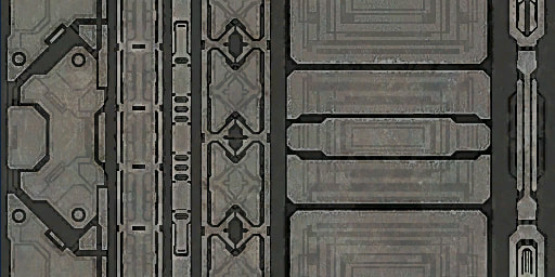
I avoided any overly abstract shapes or patterns that were obviously tailored after Halo 2 or Halo 3, since I really wanted to retain the feel of the stock material. Having worked with the stock shaders for years, I wanted to be able to use the new ones in exactly the same way as I had the old; that is, if I was looking for our version of "metal strips narrow" (a stock interior shader), then I wanted a texture that not only featured the same horizontal strip widths, but one that also felt like the stock texture, and that could be used in similar situations.
Here’s a comparison of the aforementioned texture, for illustration. The original game's version is on the left, while ours is on the right.
Our version is much more high contrast, with true blacks and a slight rosy sandstone color for the strip areas. Together, this combination further emphasizes the layers of pattern and shading in Bungie's original textures. Dano's changes to the textures also shifted the look from a lot of flat, repetitive patterns to multiple smaller components. The third strip from the left, for instance, used to be an infinite tile of those small boxes. Now, it has a beginning, middle, and end, which I was able to use in different places to create many more details than the original textures would allow. If I needed a long strip, however, it still functioned as that.
For a much more comprehensive demonstration of how our interior shader set differed from stock, I've put together the comparisons on the right. Hover over them to switch from the original textures to the new ones.
All of the images are of original level geometry, rather than TSC:E. I thought this would provide the most direct contrast. Neither is using the new directional lightmap tech that is featured in TSC:E itself, since that is tailored for the specific map.
Part III: Interior Architecture
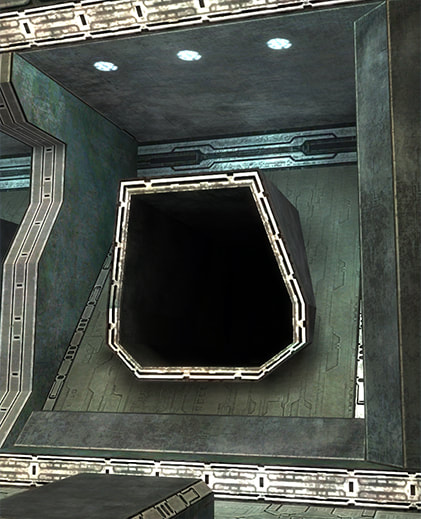
TSC's interior architecture had a complex and varied feel compared to the design repetition of the later levels, and the warmer lighting gave it a mysterious, but not necessarily uninviting, atmosphere. However, little hints here and there foreshadowed the Flood threat, such as the moaning wind from the air vents, the sealed Flood tunnels hidden in some areas, and a fair share of shadowy corners.
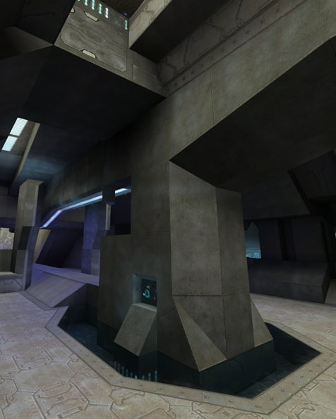
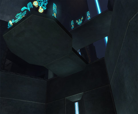
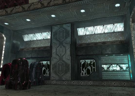
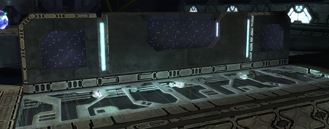
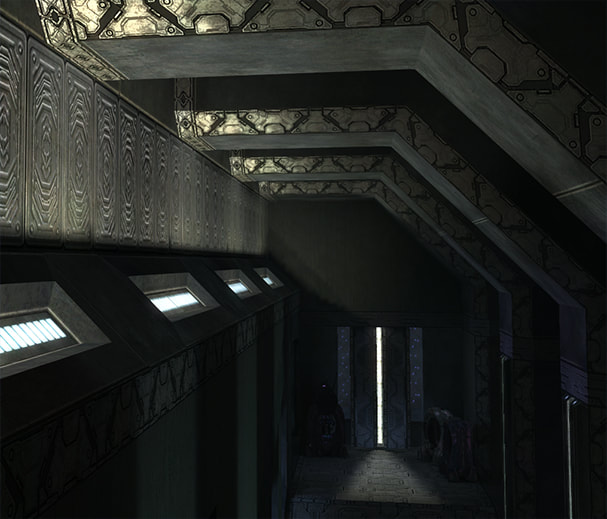
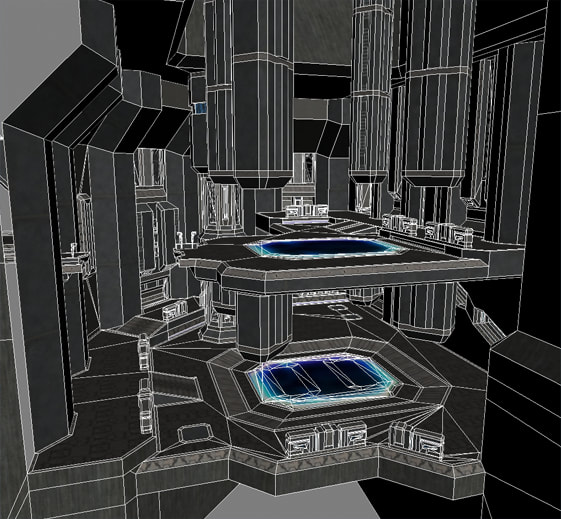
Strips with highly detailed textures were key to our style of Forerunner art. Newer Halo games have moved toward a high level of physical detail modeled into the level geometry, phasing out the texture strips that used to edge most Forerunner shapes. Even as early as Halo 2, strips were becoming less prevalent, though in that case it led to sections of dull, stony architecture. For TSC:E, I could never pull off Anniversary-quality modeling work anyway; even if I had the skill and the time, Halo 1 simply wouldn't allow it. The engine can only support so many polygons on screen before flickering errors start. Instead, I had to do as much as I could with as little as possible. Using strips to edge a lot of my shapes and the floor pieces, instead of adding more geometric detail, created a coherent and interlocking architectural design without pushing the polycount higher than the game would let me.
Strips with highly detailed textures were key to our style of Forerunner art. Newer Halo games have moved toward a high level of physical detail modeled into the level geometry, phasing out the texture strips that used to edge most Forerunner shapes. Even as early as Halo 2, strips were becoming less prevalent, though in that case it led to sections of dull, stony architecture. For TSC:E, I could never pull off Anniversary-quality modeling work anyway; even if I had the skill and the time, Halo 1 simply wouldn't allow it. The engine can only support so many polygons on screen before flickering errors start. Instead, I had to do as much as I could with as little as possible. Using strips to edge a lot of my shapes and the floor pieces, instead of adding more geometric detail, created a coherent and interlocking architectural design without pushing the polycount higher than the game would let me.
Texture strip usage in TSC:E
I considered strips to be both edging and "filler", while panels -- the dark blue-grey textures with fun details on them -- often acted as supports for structures:
Generator panel usage in TSC:E
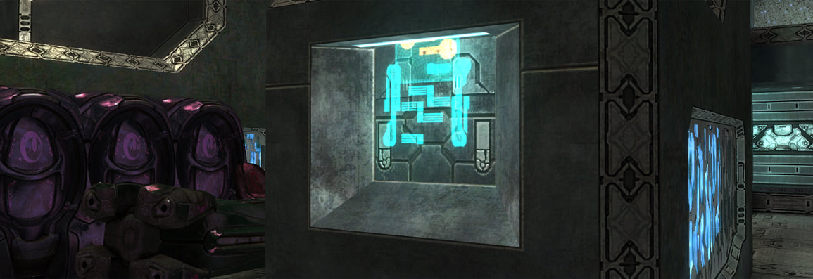
I also liked to use the generator panels to edge small details that might be too busy if I were to use strips. These hologram alcoves are a good example:
Panels as detail in TSC:E
Together, it was possible to accomplish a very detailed look without stressing the game engine too much.
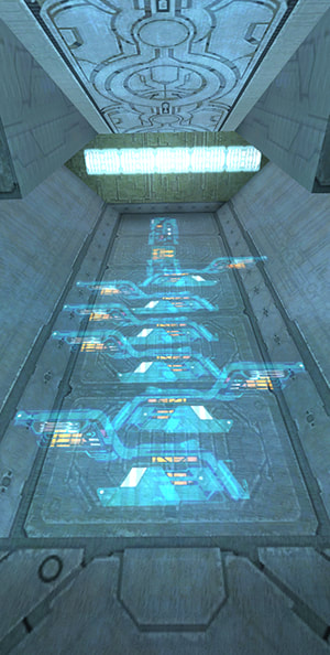
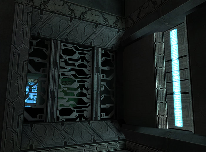
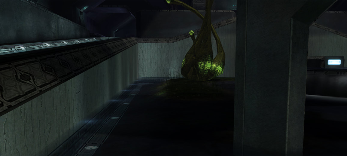
Grates were also a lot of fun to work with, especially since the player never has any idea where they lead. In the L-Room, for example, I wanted the architecture to feel more ominous the more closely the player examined it. The grates glow a sickly green, every other alcove has air vents leading to… somewhere -- and this far down below ground, who knows what all these controls do? Stock TSC wasn’t far enough into the game to warrant full-on creepiness, but because of TSC:E's standalone nature, and because I enjoy subtle creepiness, we definitely pushed the ambient atmosphere of the level further than the original.
Grates and vents in TSC:E
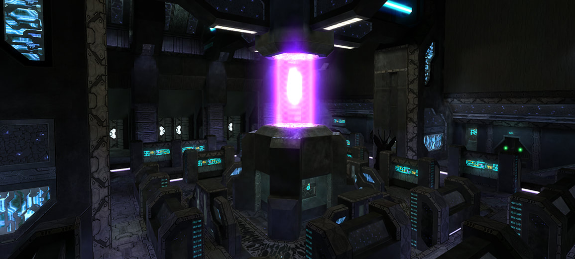
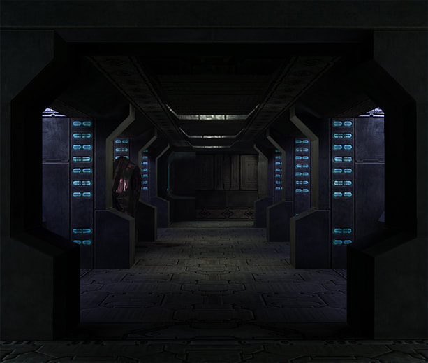
Ifafudafi proposed differing themes between the Security Complex where the player unlocks an important door, and the main Cartographer interior. The Security Complex became more industrial, with purple lighting and exposed bronze-colored pipes. Teh Lag's moving "thumpers" rounded out the sense that plenty of machinery still functioned deep in the ring. Alternatively, the Cartographer structure featured very few pipes or moving parts, instead presenting a more refined look, as if it were the "official" path, meant by the ancient Forerunners for display to visitors.
The Server Room, on the way to the main security complex
The Security Complex itself, featuring large industrial shapes and moving parts
The Lobby, a more “refined” area leading to the Cartographer
The Map Room containing the Silent Cartographer
Part IV: Lighting
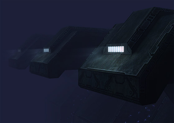
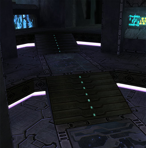
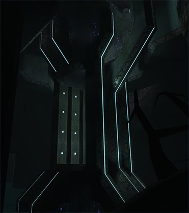
In a game level the player has to be able to see, but throwing a lot of bright light at an area doesn’t always make it great. Forerunner architecture has always provided its color through lighting rather than the actual textures. While our new shaders helped to bring out the underlying patterns, their uniform shades of sandstone and black could be just as boring as the milder stock textures with flat lighting. Ultimately, I derived our lighting style from the original level, in which rooms were lit by pools of warmer tan lighting, with blue and purple lights rounding it out. I also was a big fan of recessed lighting, so wherever I could hide lights to illuminate walls and floors, I did. This really shone in the Server Room and Security Complex, where purple strip lights illuminated the floor from recessed alcoves.
Typical TSC:E lighting style
Recessed lighting in the Server Room and Security Complex
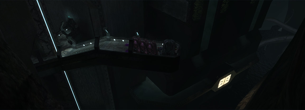
In some areas we purposefully left the lighting darker than the player might like in order to disorient or unnerve them. A perfect example is the hallway on the opposite side of the Shaft A lightbridge. As the player approaches the elevator down to the Water Hall, the light dims until the only visible area is the elevator entrance. This is very unsettling to many players, and serves to focus them to their new objective while keeping them on their toes.
Shaft A, leading to the elevator reveal
We often looked back to the original level for inspiration or notable design elements. In one of the old interior rooms, Bungie had used the light textures as spotlights on the floors. While the resolution of the original level's lightmaps did not allow for high-detail lighting on the surrounding geometry, Teh Lag liked the general concept and requested that I find a place for it in our new interiors. I found my chance when I was polishing the Water Hall, a long series of underwater ramps with marshy pools set between them. I wanted the pools to have a decayed look, as if they were once cared for but long neglected. Paired with our higher-resolution lightmaps, I realized that I could use the spotlights along the floors to create a very cool effect along the pool sides.
Pool spotlights in the Water Hall
Part V: Exterior Architecture and Texturing
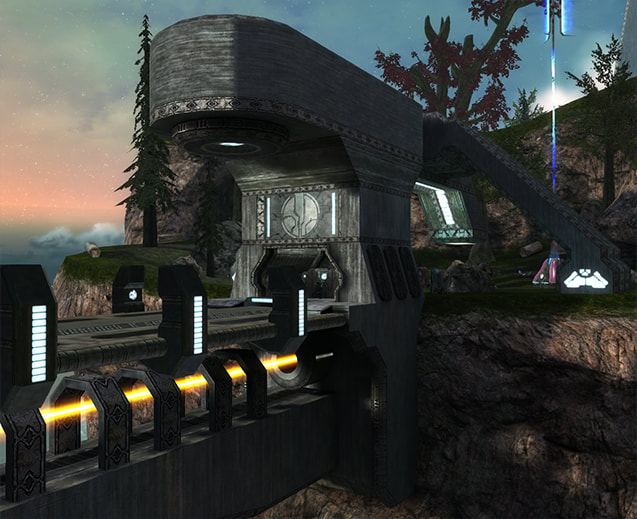
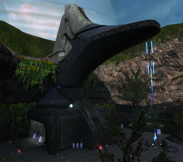
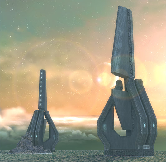
The exterior structures in the original level featured smooth curves, unusual shapes, and an integration with the surrounding terrain suggesting further bulk hidden under massive rock formations. Where Halo's interior architectural style still holds up in terms of complexity, the exterior style has dated itself due to the large flat surfaces and lack of detail. Halo: Anniversary had a huge advantage over us here because its updated graphics engine could support a very high-detail workover of the original structures. I was far more familiar with the interior style than the exterior, and various attempts to come up with something that looked interesting while retaining the original feel had mixed results.
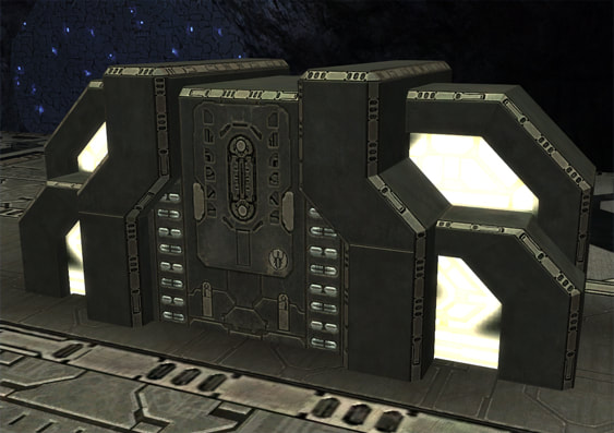
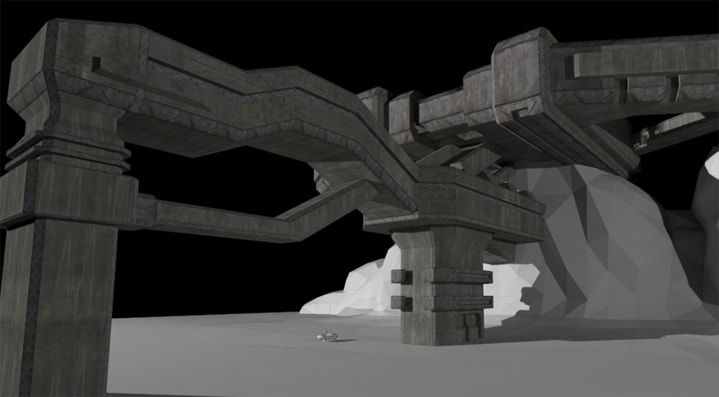
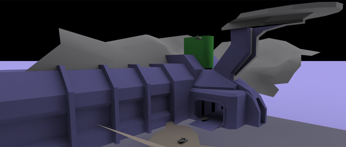
Eventually I began working with BobTheGreatII, our primary asset modeler, to create an exterior style which kept the basic ideas of the original, but matched a more Halo 3-esque angular look. He would model the geometry and I would optimize the edges, texture the model, and integrate it into the terrain.
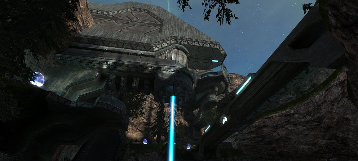
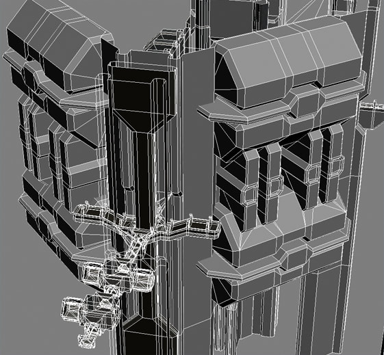
In some areas we had to transition between our architectural styles, a more involved task than merely texturing Bob's exterior structures. The most difficult instance was the Security Complex. Three large set pieces had to be matched together in a way that didn't break the game or cause too many issues: The interior, where the player engages hunters midway through the level; Bob's exterior "shell", featuring walkway supports, facades with vents and glowing orifices; and the Cave itself, a large and detailed chunk of geometry that had to meet sealed world rules at all the intersection points with the structure. Bob constructed the shell based on parameters I derived from my interior geometry. After connecting and texturing those two pieces, I worked with Teh Lag to integrate the Cave, since by that point she was doing a final polish pass on those areas.
Part VI: Conclusion
The dual goals for me in this project were for there to be no cognitive dissonance between the the common Halo player's mental image of Forerunner design and what I've built, and at the same time to produce something unique and creative. I was always looking to other games, concept art, and even fan community artwork on the subject. The final result is a representation of what I would want my ideal Forerunner style to be, focused through more than a decade worth of ideas.

