Appealing to Nostalgia
|
by BobTheGreatII (2015)
|
My time with CMT consisted mostly of creating the visual side of what many of you interact with in the final release of TSC:E. There were many incredible people who worked on this project, and I was more than happy to contribute everything I could during that time. Because of this I created a wide range of different art assets during the middle of The Truth and Reconciliation and the final release of The Silent Cartographer: Evolved. If you're reading this, you've most likely seen a lot of the objects that I created. I would like to take some examples of the assets I created, and helped create, and explain the process and things I learned during that time. Hopefully this will give the modders of Halo: Custom Edition some insight into how we went about creating many of the art assets used.
I Need a Weapon
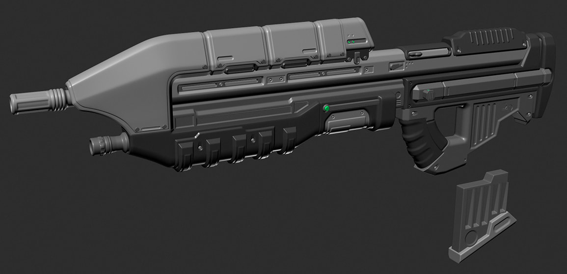
I started working with CMT sometime in January of 2012. The first project was to create a new Battle Rifle. At the time I wasn't as aware of the techniques of creating high poly models, low poly models, baking, and texturing. But I had a rough idea. The Battle Rifle was created in necessity to replace the BR that CMT was using for A50's testing. In a month I was able to turn out a high poly model that would be used all the way through development and to the release of TSC:E. After creating the model, Dano took it and optimized the low poly that I made, and textured it. It turned out even better than I was expecting it to, and only wanted to work harder to make these pieces even more interesting and better looking. Open Sauce allowed us to do a lot with normal maps and shaders in general. One of the regrets I have for us using this model until the end was that the high poly consisted of very tight edges, and because of this, the normal map didn’t bake as well as I would have liked it to. This is something to remember at all times when creating a high poly object. Senior artists will never let you forget this simple rule. If I had the time, I would have gone back and fixed this, but Dano did a wonderful job covering up a lot of the mistakes I made in 2012.
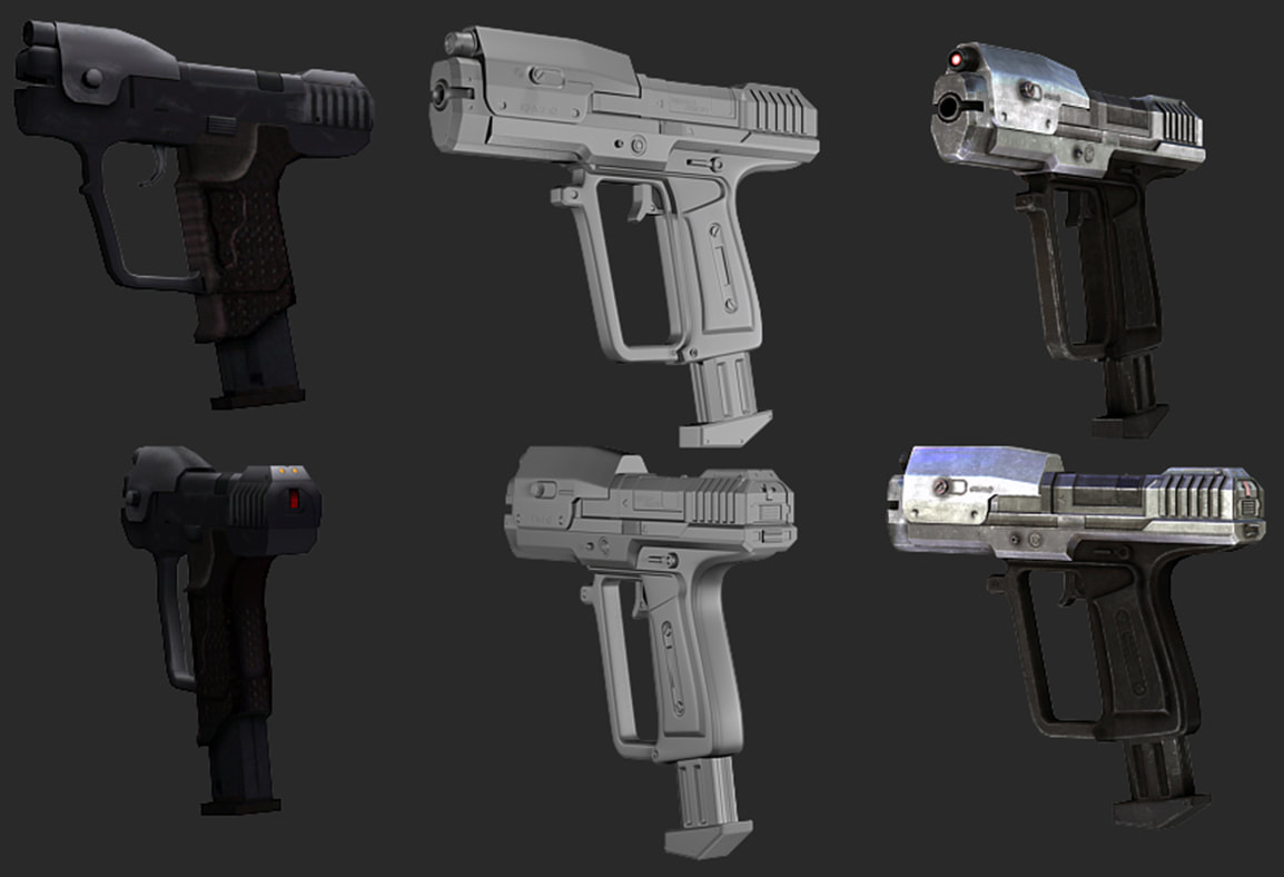
The BR was the first weapon I created for CMT, and because of that, I had no clear indicator as to what style we were going for. Silicon mentions this in his writings, but it became very clear to me that we would need to come up with something that made our models unique to the Halo universe, without standing out so badly that it looked out of place. I then went on to work on our Pistol. After learning a little more about how to accomplish the things I wanted to, I started to explore different styles. However, this didn't come right away. At first I was inclined to copy Halo: Reach's style. I always enjoyed the look of Reach's weapons and the art style (although some may argue with that opinion), but it became very clear that we would want something closer to what the original game had.
Once this idea was out there, it was important to stick with it. Halo 3 had a major impact on a lot of my design choices. As it was Bungie's last take on the Master Chief's trilogy, it used nostalgia to appeal to many of the players. A lot of the art in Halo 3 felt very familiar to that of the first Halo. And it wasn't just the reimplementation of the Assault Rifle and Pistol, but that they used a lot of the original style that Halo: Combat Evolved had. One of the more important lessons that I learned from the Pistol was that it needed to look interesting in first person. Although that seems like a funny thing to point out, it's very simple to make a weapon that looks good from all angles except directly behind it or just slightly to the left of it. Silhouette is a very important thing to many art assets that sit directly in front of the camera for long periods of time. They have to be interesting and detailed enough that the player isn't just looking at a slab of metal that fires bullets. Because of this, the Pistol adopted a lot of the traits of the Halo: CE pistol and the Halo 3 Pistol. I think the final result was something both interesting to look at and fun to use. The model was created in February of 2012 and was used in the final release of TSC:E, Dano did the bake and texturing.
Once this idea was out there, it was important to stick with it. Halo 3 had a major impact on a lot of my design choices. As it was Bungie's last take on the Master Chief's trilogy, it used nostalgia to appeal to many of the players. A lot of the art in Halo 3 felt very familiar to that of the first Halo. And it wasn't just the reimplementation of the Assault Rifle and Pistol, but that they used a lot of the original style that Halo: Combat Evolved had. One of the more important lessons that I learned from the Pistol was that it needed to look interesting in first person. Although that seems like a funny thing to point out, it's very simple to make a weapon that looks good from all angles except directly behind it or just slightly to the left of it. Silhouette is a very important thing to many art assets that sit directly in front of the camera for long periods of time. They have to be interesting and detailed enough that the player isn't just looking at a slab of metal that fires bullets. Because of this, the Pistol adopted a lot of the traits of the Halo: CE pistol and the Halo 3 Pistol. I think the final result was something both interesting to look at and fun to use. The model was created in February of 2012 and was used in the final release of TSC:E, Dano did the bake and texturing.
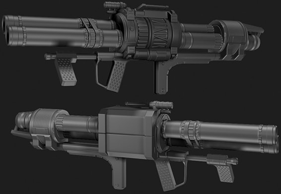
Also in February, I began work on the Rocket Launcher, it was finished in almost a week (I had a lot of free time), however, it took almost two months to finally get textured and put in-game. The rocket launcher pulled a lot of inspiration from the first Halo, with a mix of Reach's central barrel and targeting system device on the top. The initial idea was to have these "locks" that would pop up and turn red when reloading and then lock the rockets back in place when the top was shut. This was never actually used in the animation, but the geometry in the model is still there.
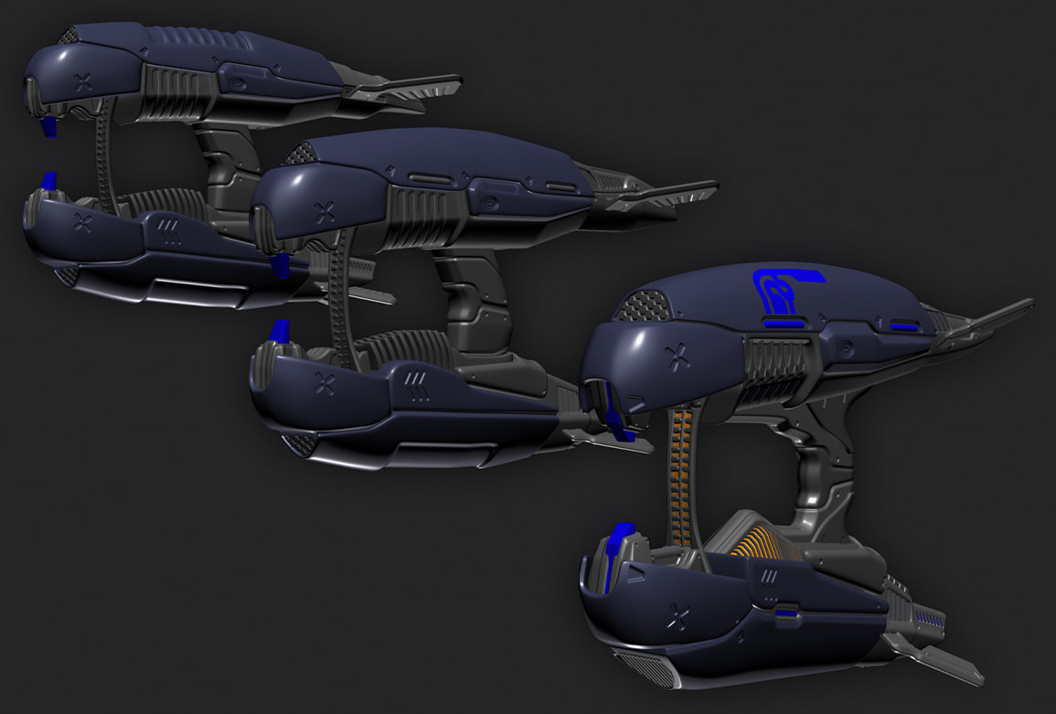
Then came the Plasma Rifle in April. It was a very complicated task, as the PR has taken many shapes over the Halo games. It was difficult to narrow down the look that I wanted. In the end the Plasma Rifle went through three versions. Although some fun ideas were played with, we went for a more traditional design in the end that was much closer to the PR in Reach. One such exploration were the ridges on the top of the gun. The original idea I had was for an exposed core on the top of the weapon that would glow the more the weapon was fired, but this was something that wasn't ever implemented.
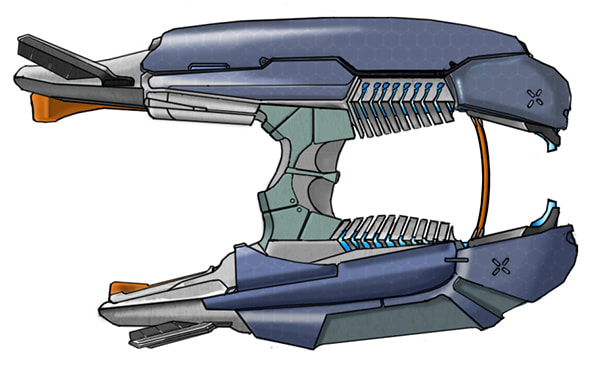
We did have a concept of the PR already created at one point, before I even started. It used similar vents, or heat sinks, seen on the Plasma Pistol.
We did have a concept of the PR already created at one point, before I even started. It used similar vents, or heat sinks, seen on the Plasma Pistol.
This idea was put in, but looked chunky and less sleek when compared to the Plasma Pistol. There were also many issues with the parts that were too close to the FP camera. Compared to the Plasma Rifles in the other games, it was clear that the back of the weapon would need to change a lot.
It wouldn't be until much closer to the release of TSC:E that I created the final version of the Plasma Rifle that you see in-game now. After texturing the first version of the Plasma Rifle, we more or less lost Dano as a texture artist. This is when I dove headfirst in and tried to learn as much as I could.
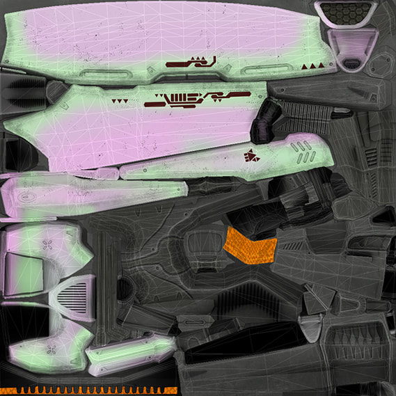
Texturing can be tricky, but much less complicated once you have a system. Layers are very important in Photoshop, and keeping backups is crucial. Many weapons that I created after Dano left went through several iterations. Using your UV space to your advantage is the most important part of texturing. With Covenant work models, I also used a technique used in Halo 4 where 343 painted in an iridescent texture under the color change layer. The purple and green colors just add an extra layer under the color change.
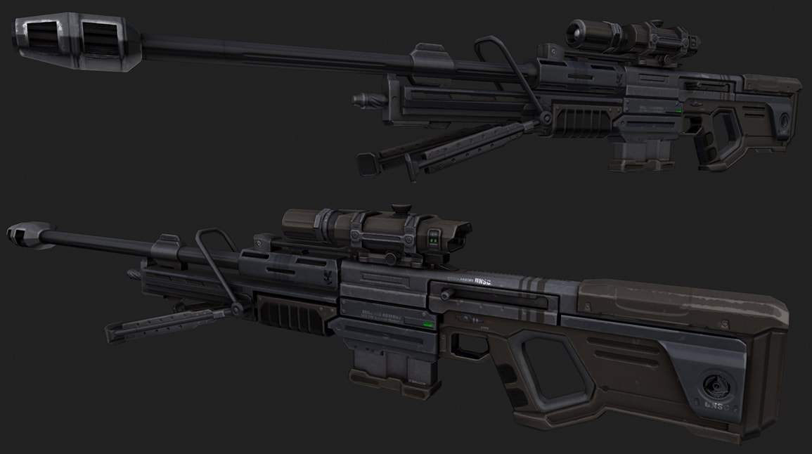
After the first version of the PR was released, I began work on the Sniper Rifle. We had a wonderful concept created for us, and I used that as the main inspiration. A lot of minor details in the Sniper Rifle are based off of the rifle in Reach. Both the Plasma Rifle and the Sniper Rifle started to explore looser edges in the high poly models. Not much changed on the Sniper Rifle between the time of creation to the release of TSC:E. In retrospect it would have felt much better to run the weapon through a retexturing phase like many of the other assets in TSC:E got closer to release, but there simply wasn't the time, and we all liked it enough to let it slide.
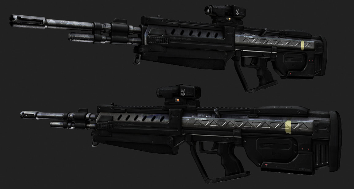
A lot of time passed between the creation of the Sniper Rifle and the creation of the DMR. The Designated Marksman Rifle was a fun project for myself. It started off as simply wanting to clean up the Battle Rifle, but turned into a much larger project in the end. Work on the DMR started sometime in August of 2012, about when Halo 4 images started floating around the internet. You'll notice some similarities between our DMR and Halo 4's because of this, although I enjoyed the blend between our Battle Rifle, and both versions of the DMR. The texture on it was lackluster at the time and I was still learning. Texturing for Halo can be tricky as Tool likes to compress textures a lot. Eventually you learn ways around that, but it's still difficult to avoid. The final textures to the DMR came much later, and although I may have gone overboard on the weathering, I kind of enjoyed that it was beat up. Although the DMR didn't have a major role in TSC:E, I was more than happy to see it show up in the end anyway.
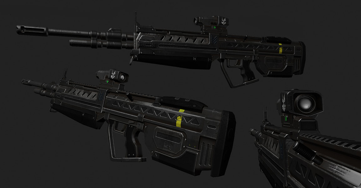
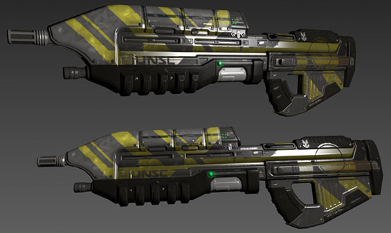
January of 2013 gave way to the Assault Rifle. This was an extremely difficult thing to get right. Many people who saw the weapon in the following months would have some varying opinions on its looks. Although I tried, again, to mix games together, it is an iconic weapon that people don't expect much change out of. Hopefully in the end people grew to like it, but it was something that I was always excited to work on and I think it turned out very well.
Much like the DMR, the AR went through a couple of texture phases to get it to look right. Some tests thrown around were the use of digital camo on the metal, however, I eventually stuck with the normal camo pattern that Dano used on his texturing for the older version of the AR. As the yellow stripe on the weapons became a running joke within the team and the community, there was always a plan to add one to the AR, even in a skin. In the end, size limits kept anything like that from ever happening, but I made sure to make the stripe on the top of the gun able to change colors so that we could always bring it back if we felt the need to. In the end the DMR ended up with the most apparent yellow stripe. Once a better plan for our beach encounter started to come into play, the idea for the Assault Rifle w/ Grenade Launcher was something we needed. I had a little fun texturing that and I was happy to see it used in the final release.
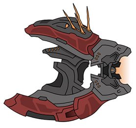
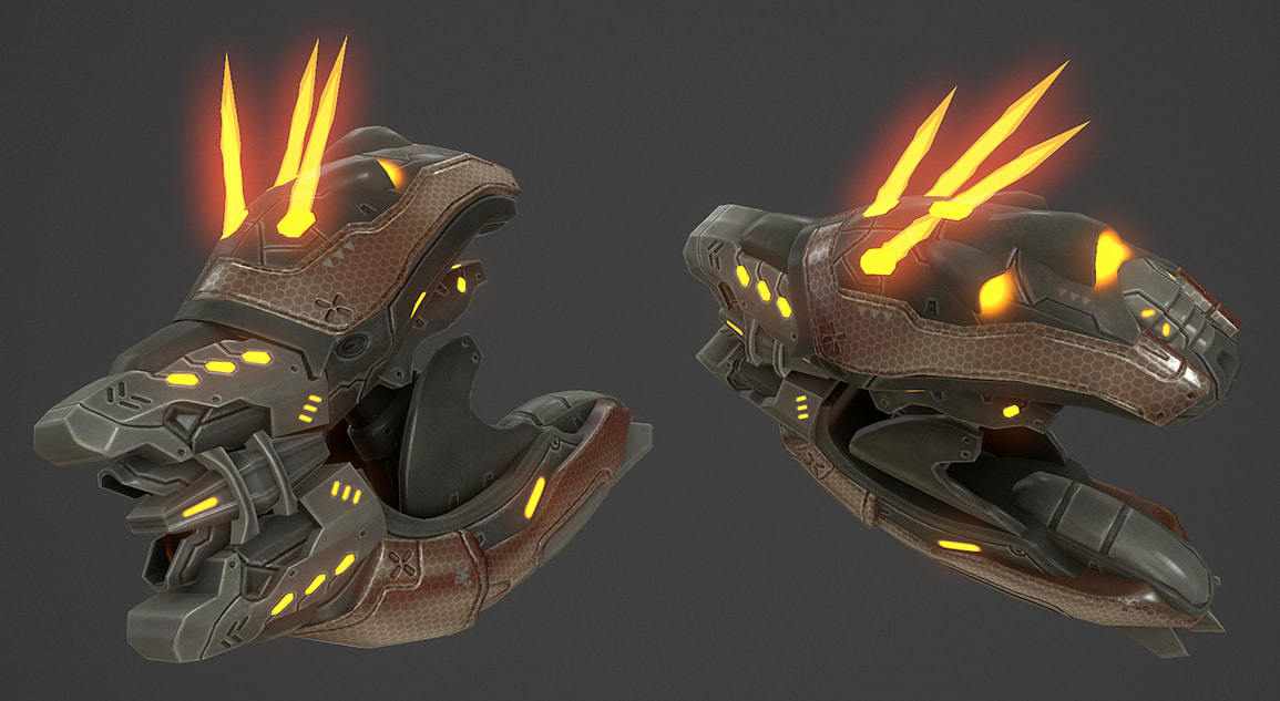
The final weapon created for the mod was the Shredder. We knew that we wanted it to be similar in design to the Needler. Many of the needle based weapons in the Halo games have very similar traits, most notably the "needles" sticking out of the top of the weapons. We wanted the Shredder to be similar, but to look more raw and powerful.
Concept art created by H3freak was the inspiration that made the weapon really come to be. Covenant design can be very tricky. Many parts are very mechanical, mixed with almost bug-like shells. The transitions from smooth colorful surfaces to more jagged hard edges can be tricky. One of my favorite parts of the shredder is how it opens to reload. It's like a bug spreading its wings, then the top flies open to allow the player to reload it.
Overall the Shredder was one of the more unique and fun weapons to work on for the mod as it gave myself some freedom to create something interesting.
Although all of the weapons in our mod are created from scratch, it is my hope that they still feel like the same weapons that fans of the Halo series have come to know and love.
Although all of the weapons in our mod are created from scratch, it is my hope that they still feel like the same weapons that fans of the Halo series have come to know and love.
Wort, wort, wort!
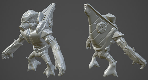
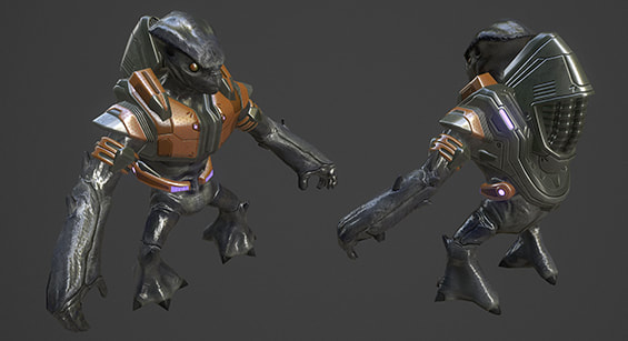
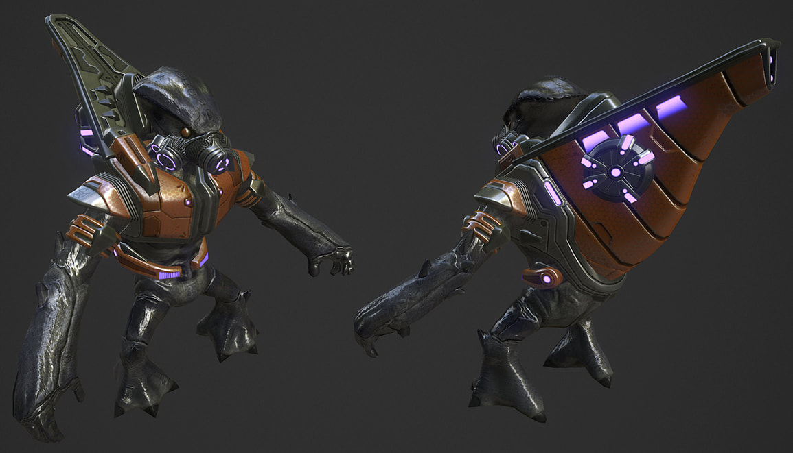
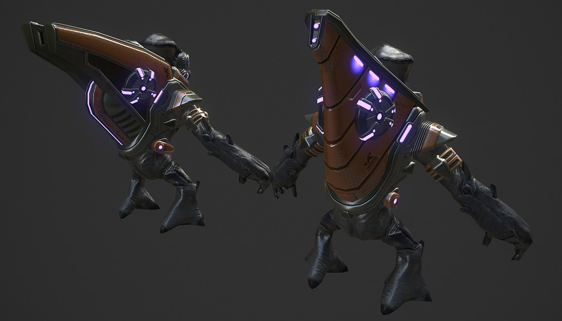
A few side projects from the creation of the weapons for our mod included our Grunt and our Shade. The Grunt was a long running project as it took me a long time to feel confident enough to work on it. It wasn't until after the creation of the final Plasma Rifle that I was able to start on the Grunt. Full disclaimer here though, I didn't actually model the Grunt, however I did do the bake, the texturing, and created both armor sets. The Grunts from Reach were the inspiration for a lot of details on the Grunt armor, however, some ideas were also pulled from either the original model, or the concepts of the Grunts that Bungie had created. In the end I think we got a fresh take on the Grunts we know and love, but also had something new and interesting to look at.
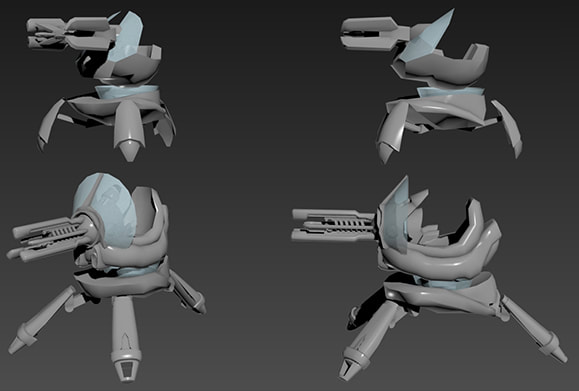
The Shade was a project that went on for probably the last half of TSC:E off and on. It was difficult to get right. We initially wanted a similar design to the original tripod design of the Shade from Halo: CE. However, the concepts we started with seemed too large, or didn't fit the feel of the rest of the game. Eventually I settled on a much more similar design to that of the Halo 3/Reach Shade. I think this let us have a little more fun with it and also allowed us to experiment with having the Shade destroyed if run into with a hog, or simply to watch it just go flying off of an edge.
There, in the cliff wall...
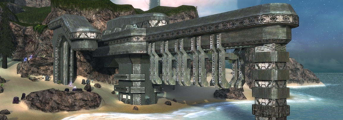
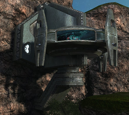
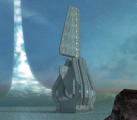
One of the more important jobs I had was helping Silicon with the Forerunner structures on the exterior of the island. A lot of these structures are massive and needed to look like they serve a purpose. It was important to Silicon and I that the island’s Forerunner buildings felt like they held more secrets in them than they looked. I liked to imagine that a lot of the buildings had a purpose, rather than just being an entrance or a pretty cover to the interior. The beach arch always felt important, but it was never apparent why the Forerunners built it the way they did. I wanted to add to this mystery. We accomplished this mostly by adding small interiors in some of the structures (like the beach arch) that the player could run through, including an elevator that went to a door that was locked. The arch pulled a lot of inspiration from Halo 3’s Forerunner design. Halo 3’s Forerunner structures in The Ark felt very important and mysterious to me and I wanted to give our players the same feeling. The Ark would go on to inspire a lot of the exterior structures in TSC:E.
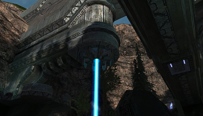
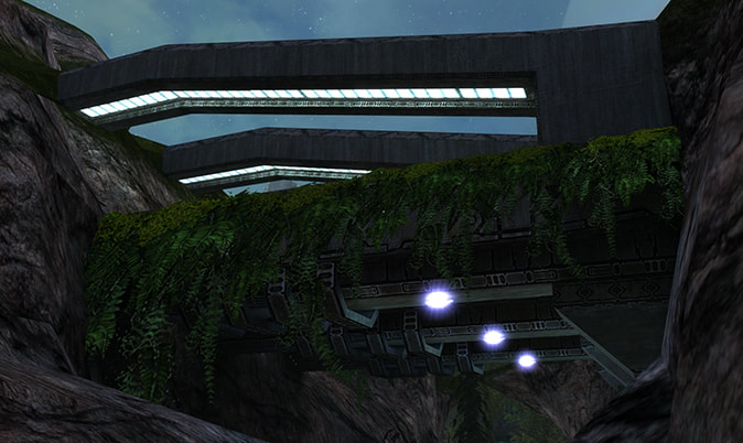
The Security Pit, as we called it, had some of the more difficult design elements, but in the end I think it really came together to be something fun. This dual layer structure that was complemented by the opposite bridge was a lot of fun to make and play on. It’s also one of our first introductions to our security beam. Its blue glow shot between two conductors was an early idea that then started a trend throughout the entire island. Some ideas even included the beams being shot between the large towers in the ocean. The structure in the cliff wall containing the Security Room is also a shoutout to an original structure in Halo: Combat Evolved.
Some small and not so small structures were also created to help give off the idea that the island had more to it than the Master Chief was going to see. A glimpse at a race that was long gone, but a look at Halo, which was still very much alive.
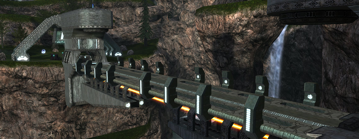
The bridge was an important addition to the growing island. It’s easy to use light bridges in Halo to have players cross large gaps after completing a certain objective. I felt it was crucial to have players see this massive bridge (also with its own security beam) come together and form something that the player can move across before coming up on the crashed Pelican. These large moving mechanical structures were some of my favorite things from the Halo series.
It was my pleasure to work on this mod. In the end I’m happy with how the art assets turned out. I hope those who play the mod can run through The Silent Cartographer: Evolved and feel a sense of familiarity with the structures they explore, the enemies seen, or even the weapons used to conquer them. Thanks for playing!


